
Before you change your logo: How to upgrade your brand identity the right way
When businesses get excited about a new look, they often overlook the most valuable thing they already own: brand equity.
Brand equity is the value that has quietly built up in your name and your look because of everything you have done. It is the recognition, the trust, the referrals, and the fact that someone hears your name in a meeting and already has an opinion before you have said a word. It is why a family will choose the provider they have heard of over the one they have not, even when the second one is cheaper.
You cannot buy it quickly. It accumulates through consistency and years of showing up.
Which is why a name change is the hardest thing to navigate. Sometimes it is absolutely the right decision. But you are asking a market that already knows you to learn you all over again, and you are paying for the privilege in marketing spend and in the awkward middle period where half your audience does not connect the new name to the business they have been referring people to for fifteen years.
That trade can be worth making. It should just be a decision you made on purpose, not a side effect of wanting a nicer logo.
Evidence over opinion
"When I was studying my Masters in Branding and Marketing at the University of South Australia, the class I found most fascinating was brand management. Partly because it was the first time anyone had shown me evidence rather than opinion. Design is a field with no shortage of opinion." - Mo, Brand Designer & Marketing Specialist at MILCO.
"What I did not fully appreciate at the time is that UniSA is home to the Ehrenberg-Bass Institute, where Professor Byron Sharp wrote How Brands Grow." A lot of the world's hard data on how brands actually get chosen has come out of a building right here in Adelaide.
A central idea in that work is distinctive brand assets: your colours, your logo, your shapes, your characters, your sounds. The cues that let someone recognise you before they have read a single word. Sharp puts it simply: they are there for the brand to look like you. They are learned associations, and people learn them the slow way, through repetition, over years. The rules for growth in How Brands Grow include creating and using distinctive brand assets, and refreshing memory structures while respecting the associations that already make a brand easy to notice and easy to buy.
That word respecting is doing a lot of work. Every time you change a distinctive asset, you are asking the market to start learning again.
Look at what global brands actually do
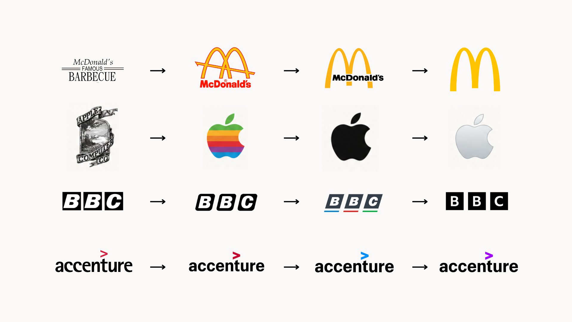
The biggest brands in the world almost never start over. Instead, they evolve:
McDonald's
The golden arches have been the core of the identity since the 1960s, when the double arch was simplified into the M we all know. Everything else has moved. The colours have been adjusted, the wordmark has come and gone, and the packaging has been redrawn many times over. The arches have not. You can recognise them at 100 metres with no name attached, in any country, in any language.
Apple
Rob Janoff drew the bitten apple in 1977. It has been rainbow striped, solid black, glossy aqua, chrome, and flat. The silhouette has never meaningfully changed in almost fifty years. Apple has become an entirely different company several times over. The shape stayed put.
BBC
The three letter blocks have been the foundation of their identity for generations. When they updated their typography and spacing for digital screens, the blocks stayed right where they were. It was a classic refresh, protecting built equity while modernising for modern screens (by the way, they paid $1.8 million for their brand update, don’t worry, we wouldn’t do that to you!).
Accenture
In their most recent brand refresh, their logo barely changed at all. They kept the lowercase wordmark and the accent mark intact, focusing on subtly updating their brand platform and expression. Yet they paid $100 million for it (yes, they paid $100 million).
Some of the most valuable brands on earth, they evolved, slowly and carefully, protecting the one or two assets that do the recognising. Sharp's advice to brand owners is to measure your distinctive assets before you touch anything, and to find out what they genuinely are rather than assuming. Most businesses assume. Sometimes the asset is not the logo at all. It is a colour, a shape, a photography style, or a name people have been saying out loud for twenty years.
"We have had this logo for ten years" is not, on its own, a reason to start again. It might be a reason to redraw it well.
Logo evolution, not revolution
A good logo does not need to stay frozen in time to stay recognisable. In fact, some of the strongest identities in the world have changed considerably over the years. The difference is that they evolved rather than reinvented themselves.
"Think of it as evolution, not revolution." - Mo, Brand Designer & Marketing Specialist at MILCO. It is a lesson she learned during her Brand Management class while studying her MBA at the University of South Australia, and one that has continued to shape how she approaches branding today.
You might refine the proportions, simplify the shapes, adjust the typography, modernise the colour, or improve how the logo works across digital platforms. The end result can look noticeably better without making people wonder whether they are looking at the same business. That is often the sweet spot for an established brand. You are not trying to make people forget the old logo. You are making the familiar version work harder for where the business is today.
The goal is not to make a logo look new. The goal is to make it look like the best version of itself.
What this looks like in real work
We have worked with organisations that already had genuinely strong, professional brand identities and did not need a single thing changed about them. Lutheran Homes Group is a good example. The identity was sound. What they needed was a collateral refresh: new photos, new brochures, new banners, and materials.
We are currently working with a well established women's healthcare clinic in Adelaide that has new owners. The name is staying, because decades of recognition is not something you throw away lightly. Everything around it is being modernised: a new website, a refreshed interior, new photography, and a colour palette that is recognisably the same, just softened. When it launches, it will feel fresh and modern, but still unmistakably like the same business - that’s a refresh.
And we are working with a national disability services provider where two partnered organisations with two different names are becoming one. That work needs research and real conversations with a lot of different stakeholders before anyone opens a design file. The outcome will still look familiar, so the equity people have built stays where it is. It will just look fresher.
When you are already established, the thinking that happens before the design matters more than the design does.
The question underneath the question
Sometimes the excitement about a new name and logo is really excitement about wanting the business to feel different. New energy, new zest, a fresh start. That is a real feeling and it is worth paying attention to. But it is worth asking what is actually causing it.
Is it the brand, or is it the culture? Is it service delivery that needs reviewing? A new logo sitting on top of an unchanged experience is an expensive disappointment. Worse than that, a great brand raises expectations, so if the delivery underneath has not been fixed, better branding can make the gap more obvious, not less.
Unsure where your brand equity lies?
Before you touch your visual identity, let us help you identify and protect the distinctive assets that make your business recognisable. Reach out today for a practical conversation about evolving your brand without losing what built it.