Brand Refresh
Maxwell Projects
INDUSTRY: Construction
Legacy, reinvigorated.
Maxwell Project Services came to us already a household name across aviation, maritime, commercial, engineering and civil construction in South Australia, a business with more than a decade of history and over 10,000 completed projects to its name. What it needed wasn't a reinvention, but a reinvigoration: a bold, contemporary identity that could carry that legacy forward with confidence.
The brief was clear. Boost reputation with existing clients. Keep the trust built over years of turnkey delivery. But shed the dated visual language that no longer reflected the calibre of work Maxwell was producing on the ground.
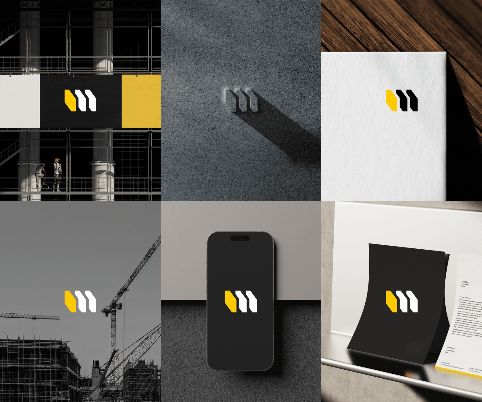
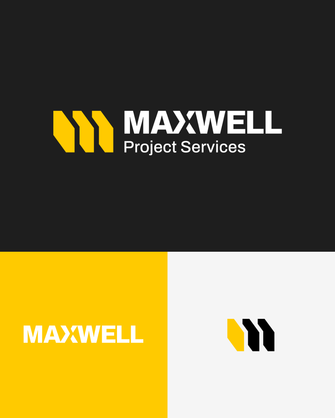
At the centre of the new identity is a custom icon built from three repeated geometric blocks, each one shaped to echo the arrow already embedded in Maxwell's mark. The repetition creates the illusion of an 'M' formed from overlapping three-dimensional forms, a nod to construction, structure and forward momentum. A second icon direction takes the same arrow language and distils it further: two juxtaposed geometric shapes forming an abstract 'M', impactful and unmistakably strong.
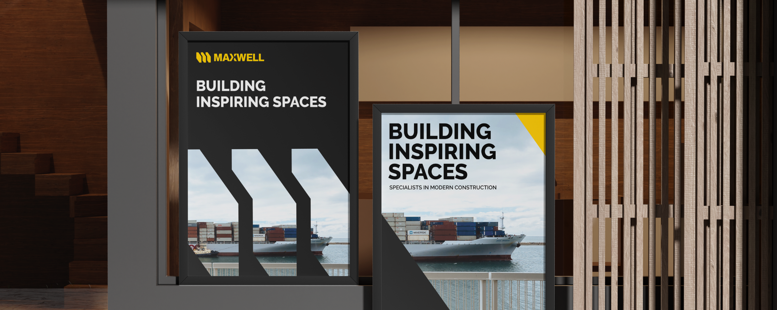
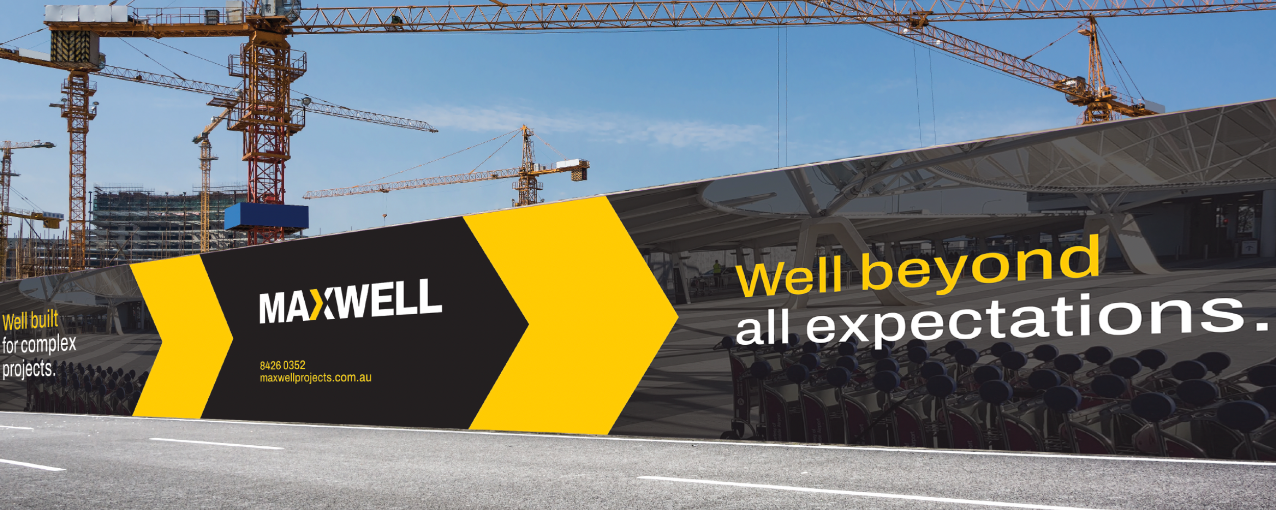
The wordmark is bold, uppercase and no-nonsense, built to hold its own on a hi-vis vest, a hoarding, or a boardroom deck. The palette stays disciplined: charcoal and black anchor the brand with authority, while a confident yellow signals energy and forward motion, with orange, green, blue and navy on hand as supporting tones across sectors and applications.
The result is a brand that looks every bit as capable as the work Maxwell delivers, professional, bold and built to last, just like everything it constructs.